What is the Bitcoin (BTC) Rainbow Chart?
The Bitcoin Rainbow Chart is a technical analysis tool used to track the performance of Bitcoin.
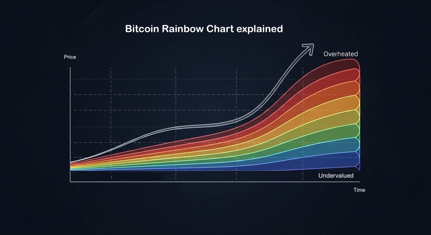
It plots Bitcoin (BTC) price on a logarithmic scale and overlays color bands that represent broad "valuation zones" over long time horizons. The basic idea is simple: where BTC sits in the rainbow can hint at whether price looks cheap, fair, or overheated relative to its historical trend.
What the Rainbow Chart actually shows
At its core, the chart uses a logarithmic regression trendline. That matters because BTC's price has moved in big percentage swings over time, and a log scale makes those long-term moves easier to compare without the chart turning into a vertical spike.
The rainbow bands are then stacked around that regression line. As price moves up and down, it "travels" through zones that have cheeky labels, ranging from deep-value territory to peak-hype territory.
Who created the Bitcoin Rainbow Chart?
The chart is commonly traced back to 2014, when a Reddit user azop posted an early version ("Actual Bitcoin Price vs. Trendline Deviance"). That original version used straight-ish colored bands on a log chart.
Over time, the model evolved. A big step was incorporating a logarithmic regression approach associated with a Bitcointalk user trolololo, which is often credited as the mathematical backbone used in later versions.
A widely referenced "V2" presentation is associated with BlockchainCenter's Rohmeo, which is why people often mention a version that looks like a bow-shaped rainbow curve
How to read the bands (without overthinking it)
Most BTC Rainbow Charts have similar labels and colors.
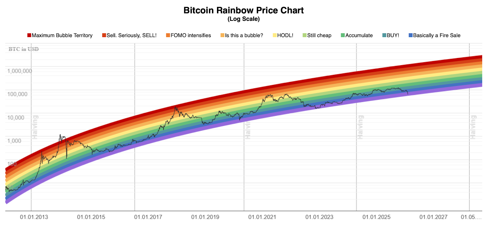
Bitcoin Rainbow Chart V2. Source: BlockchainCenter
According to BlockchainCenter's BTC Rainbow Chart:
-
Deep blues: "Basically a Fire Sale" style zones (historically very compressed pricing)
-
Light blue: "BUY!"
-
Greens: "Accumulate" / "Still cheap"
-
Yellow: "HODL!" (roughly mid-range)
-
Oranges: "Is this a bubble?" / "FOMO intensifies"
-
Reds: "Sell. Seriously, SELL!" and "Maximum Bubble Territory" style zones
A practical way to use it is not "buy blue, sell red." It is "use the band as context," then sanity-check with other signals, such as technical indicators like Relative Strength Index (RSI), and macro narratives such as major policy roll outs.
How to use the Bitcoin Rainbow Chart
The Rainbow Chart is best treated as a long-cycle context, not a prediction engine.
Pay attention to liquidity regimes and how quickly price moves between bands. Slow band-to-band moves often reflect orderly trend behavior, while rapid band jumps can signal crowded positioning or headline-driven volatility.
A simple straightforward way to use the BTC Rainbow chart would be:
-
Find the current band: Look at where today's BTC price sits within the rainbow.
-
Treat it as a long-term context tool
-
Cross-check with other signals: Use at least one momentum signal and one macro signal before taking action.
-
Helpful cross-checks to pair with it:
-
-
-
-
Volume and volatility: Confirms whether a move has real participation behind it.
-
Trend indicators: Moving averages or RSI for basic "is momentum stretched?" context.
-
Macro conditions: Rates, liquidity conditions, and risk appetite still matter.
-
-
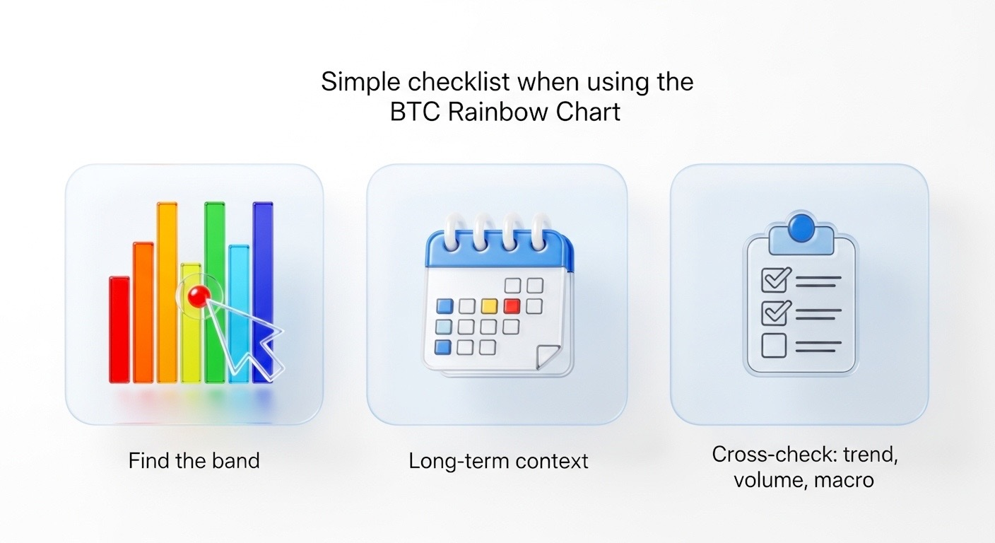
3 simple steps to guide you when using the BTC Rainbow Chart to make decisions. Source: Toobit
Use the chart to frame where BTC sits in the broader cycle, then validate it with liquidity, positioning, and macro context before making a call.
Market conditions change drastically, and so do prices. The BTC Rainbow Chart should be treated like a historical context for BTC price movements, not be your primary tool when making investing decisions.
Does the Bitcoin Rainbow Chart "work"?
It can be useful, but only if you treat it for what it is: a historical, model-based visualization.
Why it can help:
-
It compresses a lot of BTC history into a single, readable view.
-
The log regression framing can highlight long-cycle context that linear charts hide.
Why it can mislead:
-
It is built on historical behavior and assumptions. Markets change.
-
Band boundaries and labels are not universal truth. They are a model choice, not a law of physics.
Here is a table comparing the general benefits and limitations of the BTC Rainbow Chart
|
Benefits |
Limitations |
|
Fast, visual long-term context: Quickly shows where BTC sits relative to its historical trend bands. |
Model risk: Regression assumptions can drift over time, so the bands may lose relevance. |
|
Cuts through short-term noise: Helps you zoom out instead of reacting to every daily swing. |
Interpretation risk: Color labels can feel more precise than they are, which can lead to overconfidence. |
The bottom line
The Bitcoin Rainbow Chart is best used as a big-picture context tool. It can help frame whether BTC looks historically compressed or historically stretched, but it is not a standalone signal. Use it as a reference point, then validate with trend, volume, and macro context before making decisions.
This article is for informational purposes only and does not constitute financial advice. Always do your own research (DYOR) before making any decisions.
How to start trading Bitcoin (BTC)
Bitcoin's the OG—still king of the hill, still moving markets. Whether you're stacking sats or going full degen with leverage, Toobit gives you everything you need. Spot, Futures, and all the bells and whistles.
Updated as of February 9, 2026.